


Project Statement
This project aimed to design a smartphone app interface using a series of icons and a logotype for a business or organization and focused on developing the app’s UX/UI. This app, Watch Party, is designed as a hub for moviegoers and enthusiasts to find, share, and record movies and theaters that they have seen and been to, and the user’s goal is to share a movie with a friend. Using personas and user testing led to a clean, efficient, and accessible design that enhanced the user experience.
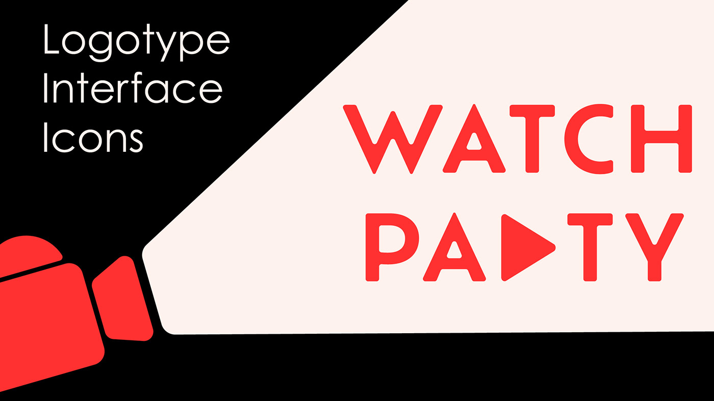
For the logotype, the typeface used is Ofelia Text, specifically the semibold font, and various fonts in the Century Gothic Pro typeface throughout the UI design. The Ofelia Text semibold font is used for the typeface because of its simple, clean design in all caps, reflecting the simple, single-color icons. The design meant a slightly edited typeface, rounding the corners to match the rounded corners on the icons better. The Century Gothic Pro typeface was chosen for the copy in the interface because, like Ofelia Text, it had a very clean, simple design. It was chosen over Ofelia Text because its single-story style lowercase letters better matched the rest of the design than Ofelia Text’s double-story lowercase letters. The two most prominent colors are red and white, with black copy and gray elements that break up the white background. Red and white are the primary colors because of their historical association with movies: red carpets and old-school red and white striped popcorn buckets. The imagery consists of various images studios could use for their movie posters.

Design Process
Prototype


Interface Final Version


Interface Version 1

Icons Final Version

Logotype & Icons Version 1


Icon and Logotype Sketches


